Veer Design is a Portuguese design studio, founded in 2008 and based in Matosinhos. We like identities, typography, creative direction across all platforms. Enjoy a recent selection of our work.
A semicolon is a punctuation mark that defines a pause bigger than a comma and smaller than a dot, an interregnum for observation and analysis; its shape draws a half-smile as if this side belonged to the moment of solution. The unit is the pixel and matrix of its genesis, and its language is the bitmap.
Client: ICNEW-TECH
Project: ICNEW Visual Identity
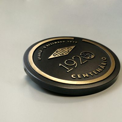
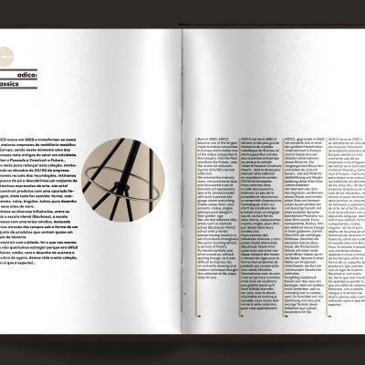
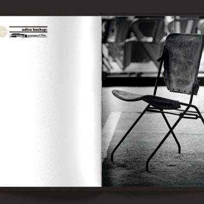
As Adico's 100th birthday approached, we retrieve yet another piece of history, a symbol of the manual tube bending. Designed by architect Januário Godinho and materialized in a wall sculpture (the 1950s), still exists today on the factory entrance. This sculpture represents the art and craft of tube bending, which has been the core development of their product collections over almost 100 years.
Client: Adico
Project: Adico – Centennial 100 years / Classics Catalogue
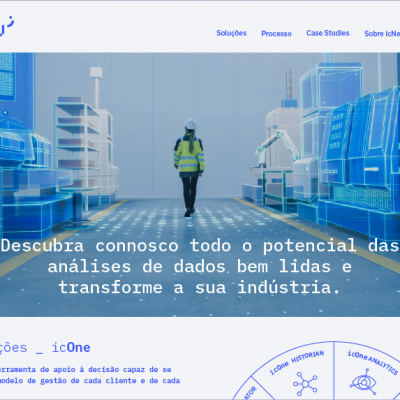
Client: TVF II
Project: Attitude – Website
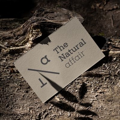
Blend, mix and integrate. The approach sums up in the morphing of the acronym TNA, that stands for The Natural Affair, in a single element. Deconstruct to build a form that illustrates the abetment of the word “affair”. The aim is to create, a symbol that can take on, various graphic and visual expressions, based on the context and scope of communication throughout the platform.
Client: Natural Matters
Project: Natural Affair Visual Identity
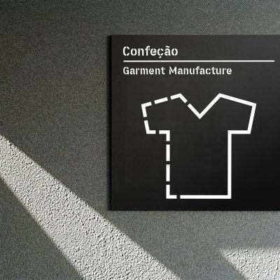
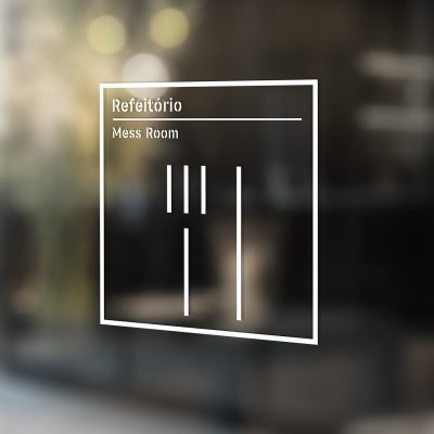
Client: Confetil
Project: Signage & Environmental Graphics
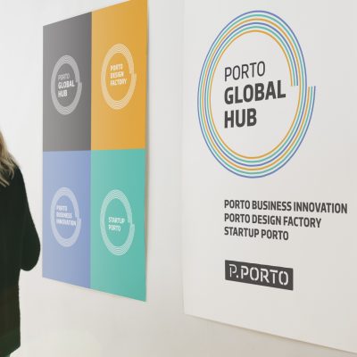
Porto Global Hub is a platform a two-way hub of many circuits, intersections and many other ideas connections.
In an eccentric or concentric, but constant, sense, Archimedes' spiral served as the basis for this design. Three swirls (Business Innovation, Design Factory, Startup) develop on themselves, creating a major one (Porto Global Hub), in which passages are intended to be fruitful and opened up to new perspectives, or even revealing new solutions. Our restyling response was to express ideas of circuits and connection points.
Client: P.Porto | Ensino Superior Público
Project: Porto Global Hub Visual Identity
From the letter 'd' we found the shape that triggered the exploration of this concept: the cube that stands for the box, to find the coordinates, NSEW, and simultaneously the letter 'd' reveal or bring to the foreground the "round-trip" directions visibly suggested by the arrow-shaped corners. The symbol then evolved to the exercise of mapping patterns that expressed trajectories and speed.
Client: DSA-Logistics
Project: Visual Identity
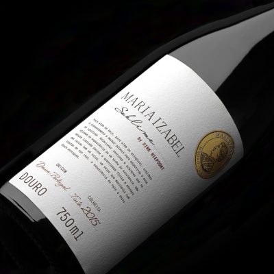
Client: Quinta Maria Izabel
Project: Sublime Wine Label
Credits: Photography — Pedro Lobo
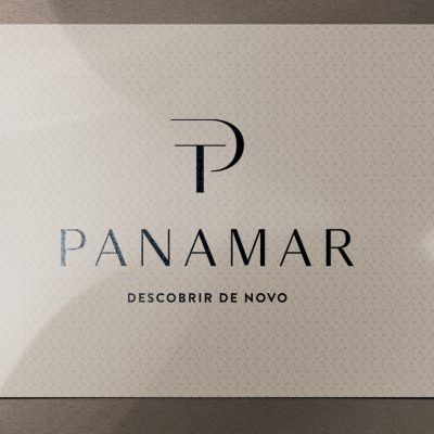
The irreverence, importance and status that the Discoveries period brought to Portugal were decisive. Prince Henry's inspiration or driving force for the discovery serves Panamar to recreate his ventures inwards and from within. The basis of the typographical elements that build the monogram is humanistic. To choose this style, was intentional, due to the variation in thickness between crossbar, arm and stem strokes features. The P surrounds the T; we found plumbs, horizontal lines and a sense of movement. From this on, we were able to bring out the idea of a sail and its mast, the draping of the Infante's hat.
Client: Panamar - Concept Store
Project: Visual Identity
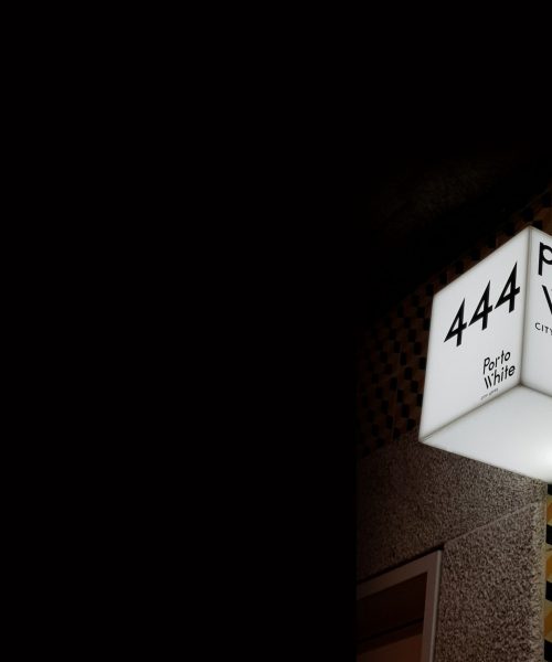
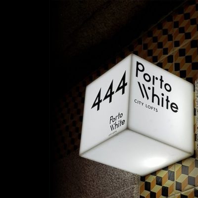
To build this logotype, we travelled to modern times in the graphic past. We found the basis for this design in the original typography, Futura, designed by Paul Renner, between 1922 and 1924. All the lettering was designed with lowercase characters, and the 'p' baseline raised to create a horizontal baseline in the word 'Porto'. The goal: to create a logo, that reflected the architectural environment of the spaces, with clean language and surprising geometries. No chromatic values were added, other than white and black, to reinforce this clearance.
Client: Porto White - City Lofts
Project: Visual Identity
Art direction for photography, graphic design for the Classics Collection. The products are pieces that were originally produced during the first half of the 20th century. All recovered and manufactured by the in-house design and production team.
Client: Adico
Project: Classics Catalogue
Client: Advancis business services
Project: Publication
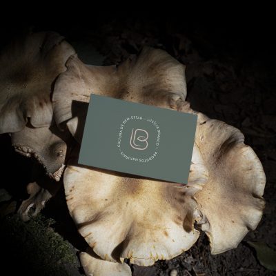
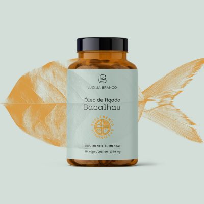
Time is the grand master of all things: the earth, air, water, sun and fire; the family, work, friends... not necessarily in this order, but time influences the order in which things in life happen.
Just as our well-being is reflected, in all the decisions we make.
All this knowledge about how the part interferes with the whole and the whole in the part, (traditionally oriental) expresses a notion of well-being.
This is the heritage and culture the LB company carries from its inception, the culture of well-being.
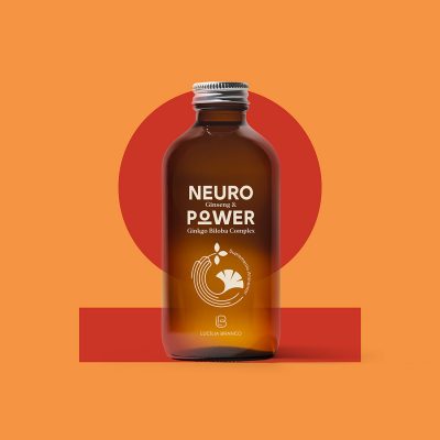
Client: Lucília Branco
Project: Visual Identity – Package
OLIVAR: This is our footprint, the Earth belongs to everyone. Through illustrations, the "lifeline" of Olive Oil and its packaging is described. Briefly portray what this means for Nature and understand where this envelopment can make all the difference.
Serrata Olivar Organic Extra Virgin Olive Oil. How to pack the sun, the song of birds... How to preserve the flavour and purity of olive oil... Recycling is giving back: in gestures and actions what the Earth facilitates.
The appeal to creativity often passes through the poke of the creator. The concept for this 2013/2015 edition was to provoke and incite to action. We tried to suggest to new creations freed from prejudices and stereotypes.
The various communication media were created to reinforce the idea of challenge and risk – stir the brain cells and show this result without shame. In this proposal, the strong illustrative, typographic and chromatic plasticity and in a retro style, work as stimulating ingredients for the challenge.